Sunday, 28 October 2012

WD2 User test


Hi! I am Vivian Kong who study in Multimedia Design. 
This is my final project for Web Design subject. 
My task is to redesign a existing website and the genre that i chosen is Information & Service website.
The website that I had chosen is My Rapid (transportation page), 
you can go to http://www.myrapid.com.my/ to see the how is the original website look like.

1st - I had changed the color mood for the entire page to match the identity of My Rapid itself, 
which are blue and red.

2nd- I had add in some vector illustration to the background so that it won't be too empty.

3rd - I add in Language bar, Log in and Register, and also Social Icons at the left side of page.

4th - I designed an oversized footer for the page and add on an animated survey bus.


I need you guys to help me answer a few simple questions.

 Thank you for helping me! <3


 Home page


Footer Design


1. What do you feel when you first look at my website? 
(a) Complex
(b) Well-organized and Clean
(c) Boring
(d) Comfortable
(e) Others (please specify for me) :D

2. Do you have any difficulties if you are browsing this website?
(For example: You don't know where my navigation is located.)

3.  Are the choice of fonts suitable and readable?

4. Is the contrast between text and its background color sufficient to make reading easy on the eyes?

5. Do you know where is my language bar? (specify at where for me) :D

6. Do you have any suggestions on how this website can be improved?

7. How do you rate the overall design of the website? (1-10)

Thursday, 21 June 2012

Different website tutorials

1)

How to Make a Vibrant Portfolio Web Design in Photoshop

url: http://designinstruct.com/web-design/how-to-make-a-vibrant-portfolio-web-design-in-photoshop/


2)

url: http://designinstruct.com/web-design/create-an-elegant-photography-web-layout-in-photoshop/


3)

Design a Warm, Cheerful Website Interface in Adobe Photoshop


url:http://webdesign.tutsplus.com/tutorials/design-a-warm-cheerful-website-interface-in-adobe-photoshop/

4)

url: http://designinstruct.com/web-design/design-a-textured-coming-soon-web-page-in-photoshop/


5)

how to create a professional website layout

url: http://photoshoptutorials.ws/photoshop-tutorials/layouts/how-to-create-a-professional-web-layout-in-photoshop.html


6)

Graphic design studio web layout tutorial


url: http://www.ultimatedesignertoolkit.com/photoshop/graphic-design-studio-web-layout-tutorial/


Websites  that I searched for my layout design.


Sunday, 17 June 2012

Ohana means family, family means no one will left behind


Inspired from Leroy and stitch movie
I'm a stitch lover and dead fans!
So, I  did this infographic to myself and all fans here!
Sorry if I left out some cousins :)
and forgive my vector art.
Okay, this infographic is about Cousins
since in movie, Lilo says we call everyone cousin and it means "family or friend".
Ohana means family <3

I use Sticker vector art style as in the movie,
Lilo makes herself an album named "Cousin" .
And she paste the pictures she take and write down their true place and abilities!
Such a sweet girl!


Here are the cropping parts of different experiment number series.


0-series


1-series


2-series


3-series


5-series


6-series


sorry for the quality, the jpg size is really big ;(


Clean version without functions and abilities :D

Monday, 11 June 2012

:D SO nice!!!

this is my brother! :D
And ya! We are In KOREA!!!!!
YEAH!!!
Since taekwondo is come from Korea, so we better show what we have practiced in this past few years in front of Korean! :D

Friday, 8 June 2012

Thursday, 24 May 2012

Mood board and Sitemap :)


Mood board


My 10 key words:
Elegant
Feminine
Cute
Comfortable
Relax
Creative
Fashion
Romantic
Down-to-earth
Warm


Sitemap
Title: How to DIY


Thursday, 17 May 2012

Beautiful Web Designs and My ideas for my own design


Meomi Cloud House

URL: http://www.meomi.com/


Anaylsis: 
-The flash design is very interactive, when you touch the specific icons, they will respond back to you.
-The color mood is consistent, all are under earth tone. (good for the eyesight)
-The art style that used are graphic and is illustration without outline.
-The typeface they used is readable and legible.
- Some of the flash design will make cute sound and smile back to you.(this might get attention and make people feel happy) SO CUTE!!
- The grid arrangement is neat and align properly in box form.
- Even the loading bar and scroll bar are well-designed! Very interactive(it changes emotion when you touch it)


Kreativa Unlimited

URL: http://www.kreativaunlimited.com/en/contact.html


Analysis:
- I like the style they using real object to decorate their margin space <3
- they also add one some illustration in stitches
- The typeface they used are curly to match the stitches graphic, but still readable :)
- There are a lot of sewing graphic that made this website look interesting and real, like something touchable.
-The color tone is more to earth tone and classic feel. (more friendly and trustable)


Justdot

URL:http://www.justdot.gr/


Analysis:
-Their design are only under one-page design
-When you click on certain subtitle, it drag you down to that particular section. :D
- The art style is sketchy illustration that using white chalk draw on the blackboard.
- The alignment is neat that easy for viewer to read and understand where to read.
-Since the background is dark tone, so they use the light color for the typeface .
- And different color stand for different section to remind viewer they are on the "that" section.
- Interesting thing is you might not realize that some of the illustrations will link you to other page or move until you click on it. (try on that blue bird-link to twitter)


Monoface
URL: http://www.mono-1.com/monoface/main.html


Analysis:
- So cute and FUN for a lot of faces change in just a second! even children might like this idea!
- The interesting part is you can create a different monoface when you click on the mouth, nose, head and each eye :D (there are 759,359 possible faces)
-This idea prolongs the time that viewer  stay on their page.
- The color of background is clear and clean :) to focus on the faces and messages sent are clear.
-they use light blue  to create refresh feeling .
-The typeface they use is readable.


My first idea:
How to DIY?

I want to create a website that is interactive that can show the step-by-step methods to teach people that like to DIY. I decide to focus on Fashion and Creative DIY.

Character Design ------> Self-portrait(avatar)
Color Palette----------> Background (Tan/Brown)
Graphic Design ---------> More to sketchy & illustration style


My Second Idea:
How to make dessert?

Everyone loves desserts. Me too :D So, I want to do something like tutorial that using flash characters to get viewer attention. 
Character Design ---------> Cooking mama,papa,sister,brother and baby.
Color palette ---------> Background (based on the dessert color)
Graphic design ----------> realistic art style


*more to realistic art
*the color mood make people feel hungry
* easy to understand


My Third Idea:
How to get BF or GF?


I think nowadays people are so afraid of being lonely or afraid to get the one they love/like. Thus, I am here to teach either BOY or GIRL to get their love one. Yeah~~ :3~~~

Character Design ------> boy and girl
Color Palette----------> Baby color palette
Graphic Design ---------> Chibi style


Thursday, 19 April 2012

好心情回来料:D

改换换心情了

:D

早上
大比来我家一起去吃早餐
要去吃鱼面
结果
我赖了1个小时
又被挨骂了
哈哈哈

==
更惨的是
到了rejang park
鱼面居然没开
T^T
对不起啦
对不起

结果结果勒
我们又去佰乐盛
吃早餐
又是我请客

几时到你请我??????
哈?????

一路都跟你聊海贼王
还蛮开心一下的
哈哈哈

今天
炒了米粉
亲自下厨给弟妹吃

很辛苦地说
大比比较辛苦吧

我拿不起锅
一直乱跑!!
谢谢你啦
:)
又帮了我一次

虽然mok mok了一点
可是还是有味道地啦

:D
谢谢弟弟(steward)
吃了两碗喔!
很委屈的说~~

肥弟肥弟两个也不错啦
都被我逼吃了
:(

我妹默默的吃
说还不错
:DDDDDD
哈哈啊啊哈哈哈

你们一个两个在安慰我哈??

今天下午
下了很大很大的雨
驾车好辛苦喔

因为我没带眼镜
很危险哪

然后
回家后就偷偷跑去淋雨了

真的不是普通的冰
回到家
摊在那里

不知不觉地
睡觉了

;)

醒来又要载人
原来
司机真的不好当

不过有成就感啦
:D
身为姐姐的责任
尽到一点

今天没什么很不开心的事发生咯
结束

。。。。。。。。。。


Tuesday, 10 April 2012

天都不收你

他们都说
坏人都晚死
因为天都不收他们

让我很气
可是听到我男友说
他们都死得比较惨

让我甘愿了一下
这样
很坏吗?

让我想起以前得事

哈哈
今天
说说一个”男人”的坏话吧。

我只记得他对我的坏
因为我记仇

好的都想不起了
哈哈哈
所以说千万别得罪女人是真的

你曾经说只爱我一个
什么都给了你
换来的是一个背叛

比背叛还要背叛

我没想到你贱到
让我傻傻做了第三者
不是一天
不是一个星期
一年!

啊。
我怎么没发现?

你的功力还真好。
说谎不用打草稿都可以像真的一样

我也傻
也怪自己盲

现在回想起
原来很多蛛丝马迹
是我没发现

难怪
你从来不想陪我逛街
(怕被熟人看到)

难怪
你从不在外面牵我的手
(怕熟人告密)

难怪
你从不让我认识你的朋友
(怕劈腿被揭穿)

只在电影院里让我牵你

只在我生日陪我出来

印象最深的是
有一次
你在我家陪我

突然
电话响了
是信息

我看了
你以为是DIGI

结果是一个女人写
:“老公”

我看了当然傻眼!
马上生气!
伤心地把电话丢给你!
连解释都不想听!

你很厉害
真的

你二话不说
马上在我面前回复她
“神经病!”

你抱着我
要我听你解释
我不听
就是不听

可是看到你回复她那样地话

心里当时想也许又是
哪个疯女人要抢他吧

默默地原谅了你

女人!!
看到这里

你以为事实真的是这样?

难道
你没想过说
也许
那个男人当下
必须保住我这个女人先

所以
他先对另一边狠心!

他成功保住我这里后

大可以回到家后
马上打给那个女的说
“亲爱地!
刚才我兄弟作弄你!
别当真!
我只是出去一下!”

对吗?
女人女人

有时候
事实不是连亲眼看到
都可以相信

事实
必须经过查证!

才可以相信!

眼前的
也可以是假的!
听到的
也可以是假的!

真真假假
假假真真
等刺到你了!
伤到你了!

你才懂得相信!

这是真人真事
发生在我身上

说出来并不丢脸

而是
不希望
同样的错误

一样是女人
跟着我一直错下去

我知道
你们还在一起

哈哈
不是祝不祝福的问题
我不针对“她”
我针对“他”

至少让我知道
你不好过

我心可以得到一点
安慰

我这样贱?
我这样坏?

随便你们怎么想

因为不是发生在你身上

所以我不在乎
你们的评论
流言

。。。。。。。。。。。。。。。。

大比
你说我这样想

是我还放不下

我只能说
不是

你不信也没办法
你坚持你的想法

我也有我的想法

我只是后悔

我没能更勇敢

至少是一巴掌

我也甘愿

如果是你被这样耍

我看

你杀了她都有


Monday, 27 February 2012

人在做,天在看

身为一个已经年过半百的人了
应该懂的礼貌礼数
你还不懂吗?

百行[孝]为先
你连孝都不能做到了
你还剩什么??

财产
挑拨
大声喧哗
煽风点火

在我的对嘛病床前
ngiao ji地一直讲人贪她财产
对人好是有目的地

我看在眼里
全部人看在眼里
我想
最贪
最想要地人是你吧!!

怎么对老婆
怎么对孩子
你自己知道!
不是天不收你!

是你时间还没到

最可怜地事
你知道是什么吗?

就是没孩子送终
搞得四亲不认!
你就知道后悔怎么写了!

现在
你身在福中不知福!
有一个不离不弃地老婆!
却被你拳打脚踢!!!

你如果再放肆一次!!
我就毫不客气地对你了!

你不配得到我地尊重!!

唯一我会尊重你的只是你年龄的号码!!

剩下的!
我不会客气!

请你自重!!!!!!!!

天会收的!!!!

Friday, 10 February 2012

First Studio Photography


This is not my actual model~~
But let me introduce~~:D
She is Celine~~:D
She shows Sunny characteristic~


Here you go!!!!
My model~~~=DDDD~~
Cheau Hui~~~<3
She needs to show the opposite character of being "NICE"~~
Hmmmm....
My shooting skill still have room of improvement~~:/


Maybe this is one of the best shots~
FOR ME~~~~
=)~~
So which one do you think is better???
That really show the character for being "not reli NICE"???
HAIZZZ~~~

Wednesday, 8 February 2012

往我的第一个十万块出发!!!


今天刚拿到的最近10仙!!
比较轻哦~~:/
是不是偷工减料勒??


我的piggy bank里面的coinsssss~~~
:3
有成就感~~~
存了快要3个sems~~~


我老公说
想半夜进我房间偷钱~~
哈哈哈!
他说我有好多五毛的说~~
:DDDD~~~


本人比较喜欢收集五毛~~
:3


全部有~~xxxxxxx~~~
:3
~~~
你们觉得有多少???
猜猜看咯~~
=D~~~

Wednesday, 1 February 2012

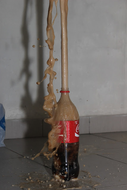
可乐喷泉!!!!


总共有20粒mentossssssssss
:3


准备咯~~~
我来咯~~~


超美的水母头!!!!


威力真大。。。。。。


FREEZE motion
水珠好漂亮的
浮在半空中呢!


差不多结束了
可乐也少了一半。。。
==